
The Brand
Barrier Free Oregon is a non-profit organization dedicated to serving the disabled population in Oregon, through education and community outreach. They aim to advocate for state and local legislation and provide technical assistance regarding accessible design and promote ADA compliance.

PROJECT/ logo designs
KEYWORDS/ action, freedom, community
POSITIONING/ accessible
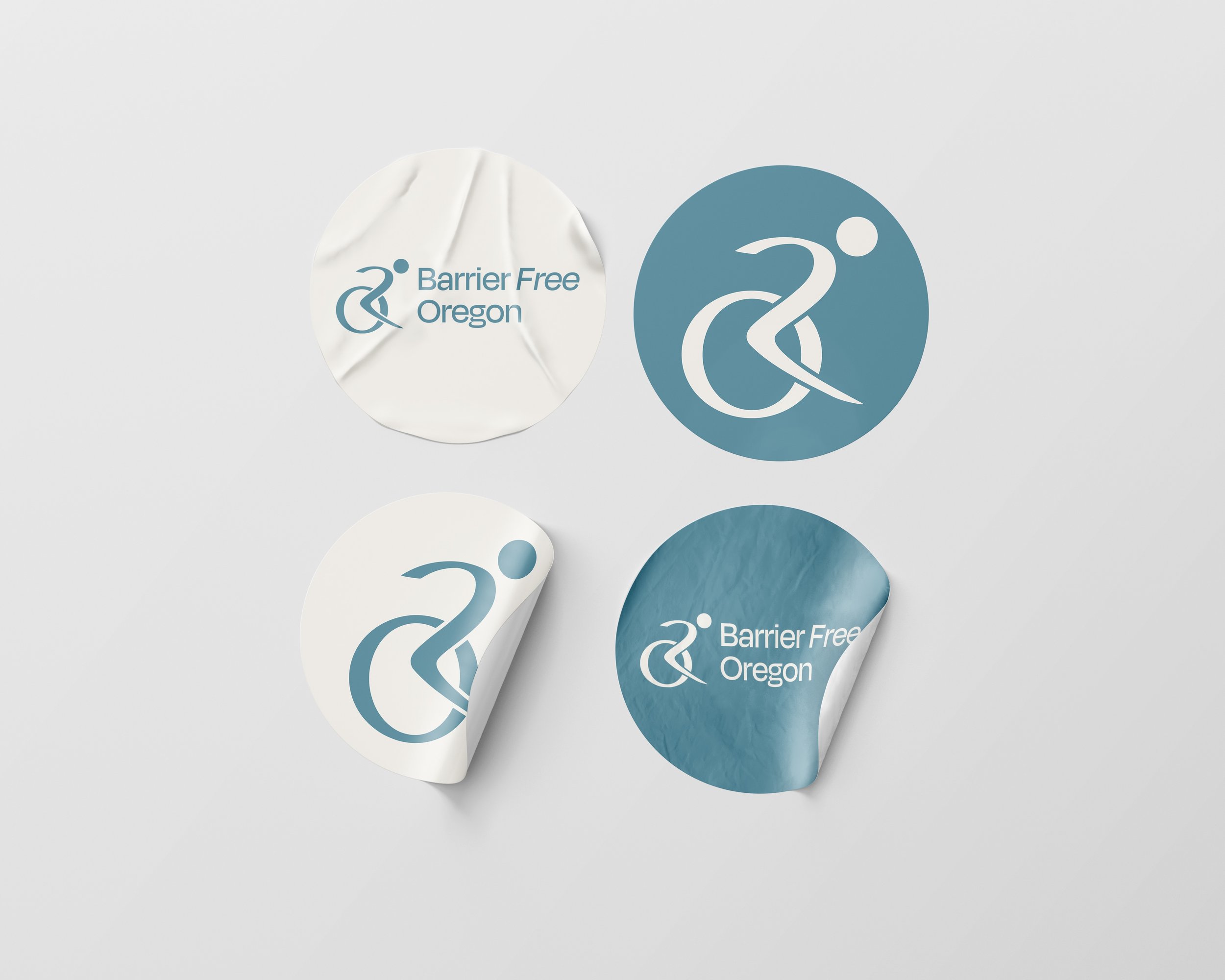
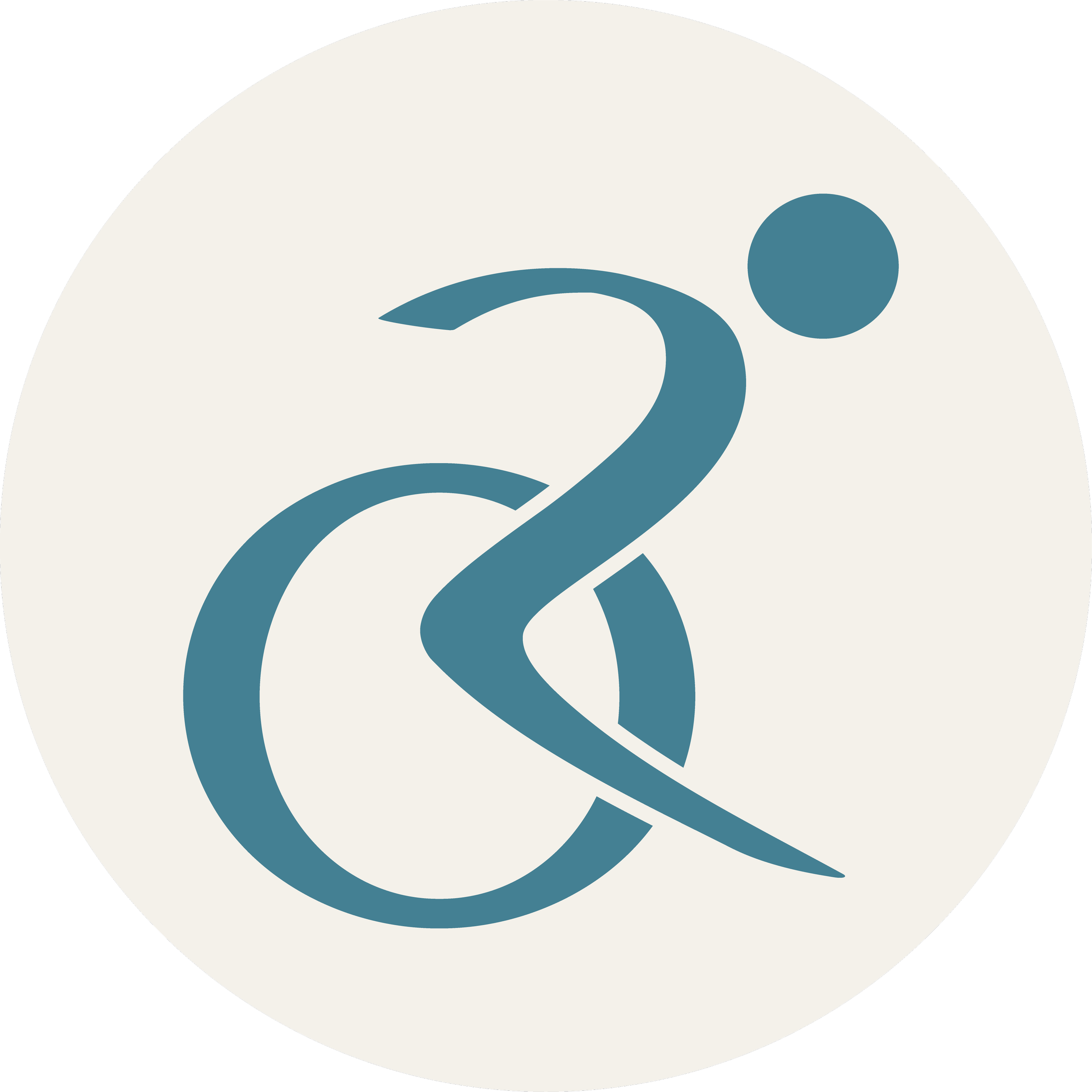
(Logo Mark)
The logo mark is not-your-typical disability, or ‘handicap’, symbol. It’s intentionally set at an angle to convey action, freedom, and the act of breaking through barriers.
During my design process I came to the idea of intertwining an “O” and “R” within the logo mark to represent the state of Oregon.
This was accomplished by strategically shaping the body to resemble an “R” and pairing it with the circular wheelchair outline.
(Final Deliverables)

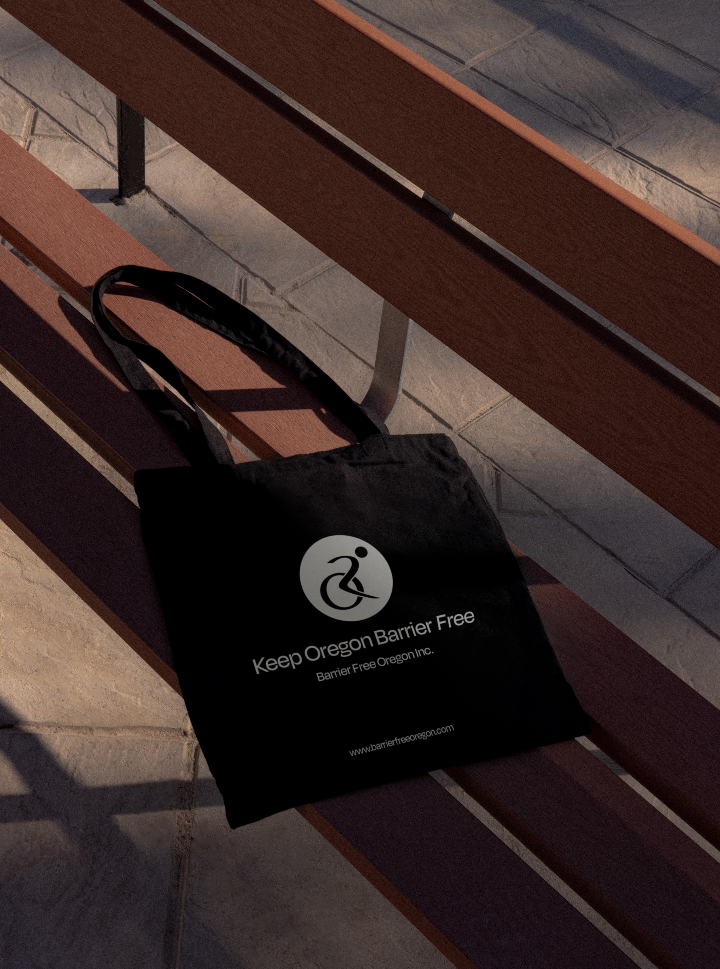
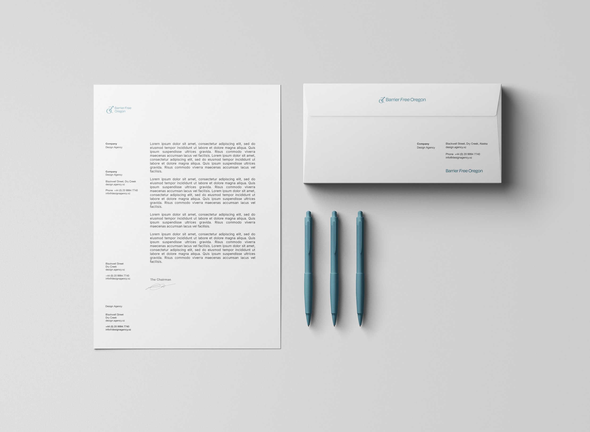
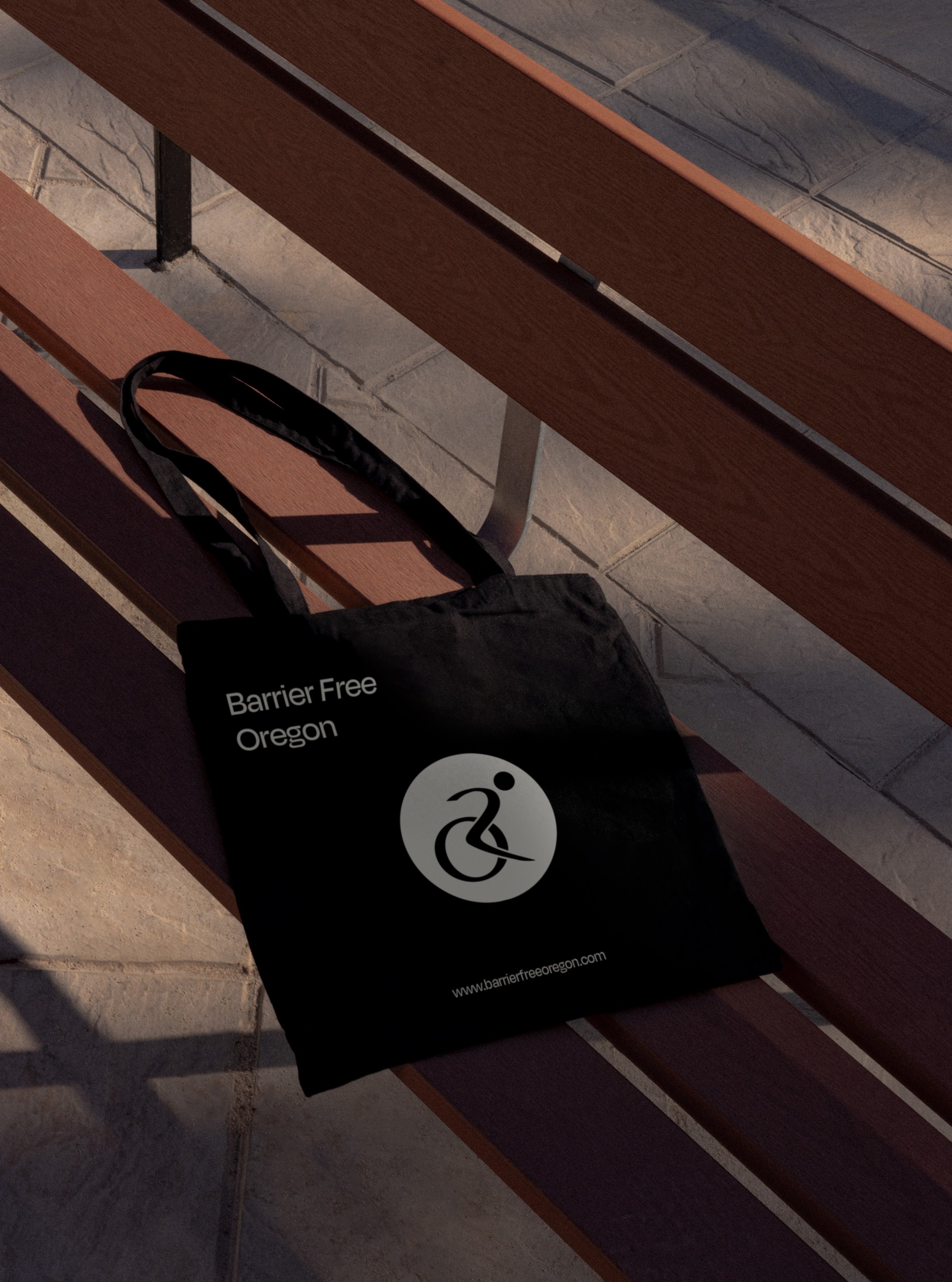
Final deliverables of this project included 3 logo variations (primary, secondary, and tertiary), 2 logo mark variations, and 2 color variations for wide-spread applications.
A Brand Guidelines document was also provided to display how to correctly put each logo to use, and grow with the designs.
View the brand guidelines at the end or click here!